
Does your website describe the tools you use, or the problems you solve for your clients? Until this September, ours mostly did the first.
Lombiq.com was written for technical people. It talked about Orchard Core, the open-source .NET framework and CMS we've built most of our projects on, and offered development, consulting, and training services around it. That made sense for years, since many of our projects started with a team that already knew it needed Orchard Core. But the people who decide on a critical platform project are usually not developers. They want to know whether we can take responsibility for a system their organization depends on.
Over the past few years, we felt this gap more and more. As we reached out to and met potential clients in various settings, we continuously adapted how we talked about our work: less about the technology, more about the problems we solve. Then we sent them to our website, which told a different story.
Let's look at how we fixed this inconsistency!
Why we started with the message
When a website stops serving its purpose effectively, the first instinct is often a redesign. Our problem was what the site said, and to whom. A new look on the same message wouldn't have changed that, and any good designer would have asked us the same first question: what do you want to say, and who needs to hear it?
So when we planned the project earlier this year, we set the order: restructure the content and the messaging first, then adapt the design to it. We already had a brand identity (colors, fonts, logo, and the components we use in our brochures and one-pagers), so the visual work could build on it instead of starting from scratch.
Starting with the message
We first agreed on how we describe Lombiq to someone who isn't a developer. The answer: we build, modernize, and support mission-critical web applications, and our clients stay in control of the code and the direction. Every page followed from that.
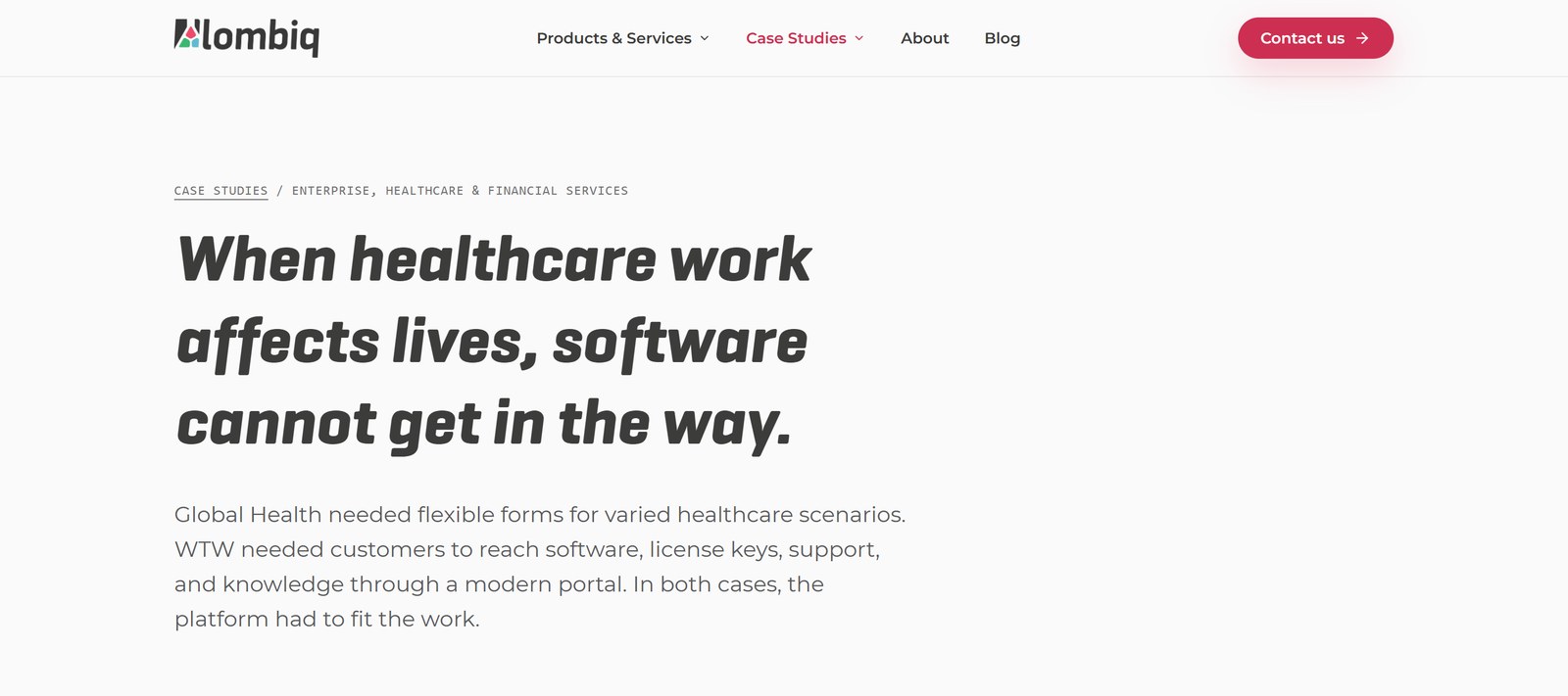
The homepage now opens with the situation our clients are in: their critical system has to change, but it can't stop serving the business. The technology moved to the background. We choose what fits the problem, which is usually Orchard Core, and teams that already use it find our relevant services on a separate page.
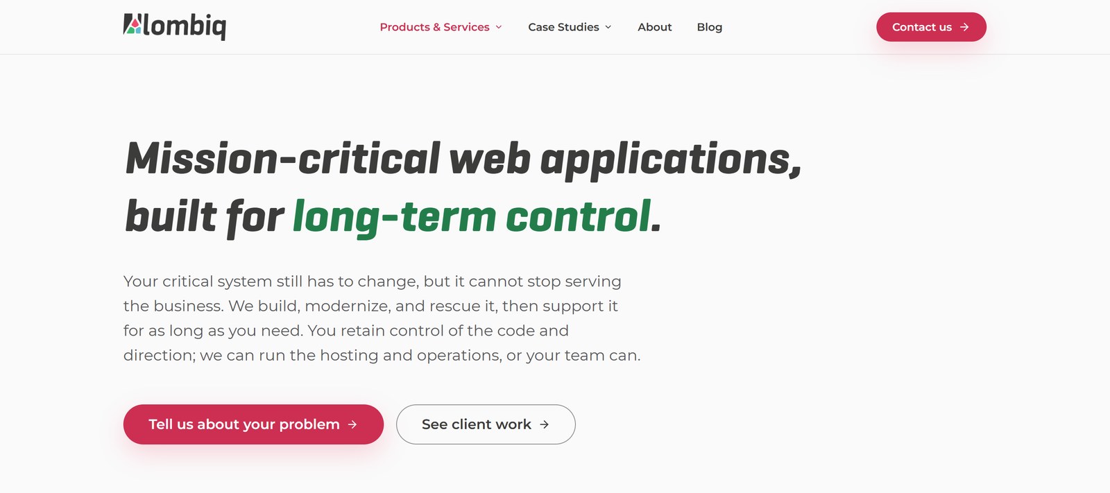
We grouped our case studies by industry, and each group opens with what was at stake: healthcare workflows, public services residents depend on, a trade-show deadline that wouldn't move. And where we were tempted to describe ourselves with adjectives, like "European engineering rigor", we wrote down what it means in practice instead: documented decisions, automated tests, monitoring, and controlled releases.
We also made two services visible that were hard to find before: software audits and technical due diligence, for organizations that need to know what's inside a system before they acquire, fund, or replace it, and enterprise data, analytics, and AI, where AI comes after the data foundation and only where it improves a real decision.
AI-assisted, with experienced people making the decisions
We used AI throughout the project, but not by asking it to write us a website. Over the past months, we've built a shared library of guidelines for our AI tools: who our clients are, how we talk, which claims we can back up, and which phrases we never use. Our team uses it for marketing texts, and the website copy was drafted with it too.
The drafts were only the starting point. We built a working prototype of the new site in our design repository, and our founders reviewed the visible content line by line, the same way we review code. They rewrote sentences, questioned claims, and caught details the AI got wrong, like invented facts in team bios, before anything went live. Many pages went through several rounds like this.
We also asked for an outside view. Karell Ste-Marie, a CTO and advisor from our network known as The Serious CTO, went through the pages with us and asked the same question about almost every block: what problem does this solve for the reader? His strongest message was to write from the client's pain: decision-makers only keep reading when they recognize their own problem, so he kept asking how big the pain was that we had solved. That set the intensity of the whole site, with pages that now open with what's at stake, like "When healthcare work affects lives, software cannot get in the way." It also led us to move the technology to the background and to give AI its own page, offered only for well-defined problems, never as a buzzword.
This is the difference between AI-assisted work and handing over whatever a prompt returns. AI made drafting and iterating fast, but people with years of experience in our business decided what the site should say.
Rolling it out on a live site
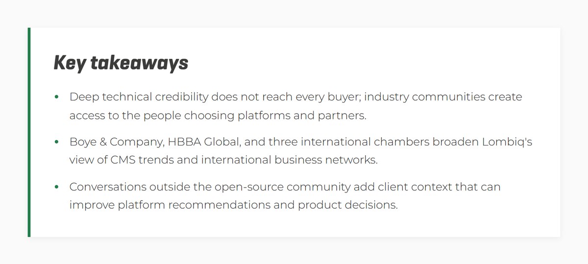
The new site replaced a live one with years of blog posts and case studies, so we treated the rollout the way we treat client platforms. Every page is built from reusable content blocks, which lets our team update a page or reorder its sections without waiting for a developer (we wrote about this approach in our DotNest.com rebuild). Blog post addresses kept working, and our recent posts now open with a short Key Takeaways box, so a busy reader gets the main points before deciding whether to read the whole article.
Before a change goes live, automated tests built with our open-source UI Testing Toolbox click through the site the way a visitor would. They check the pages against strict accessibility rules and compare screenshots with the previous version. A broken form, a hard-to-read color combination, or a layout that suddenly shifts gets caught by the tests instead of by a visitor, and we can release changes often without holding our breath. Accessibility is a compliance requirement for many of our clients, so we hold our own site to the same standard.
What changed for us
The new Lombiq.com went live in September 2026. The most important result is that the website now shows how we work, not only what we work with: we take responsibility for the result, our clients can keep control of their code (if they choose to do so), and we treat every change with care, from the first conversation to the tests that run before a release.
If your website still describes your tools instead of the problems you solve, tell us about it. We'll start with the message, and bring in our design partners when the project needs them.


